
Starting from outline details in the project brief I began to try to understand my potential user by creating a User Persona.
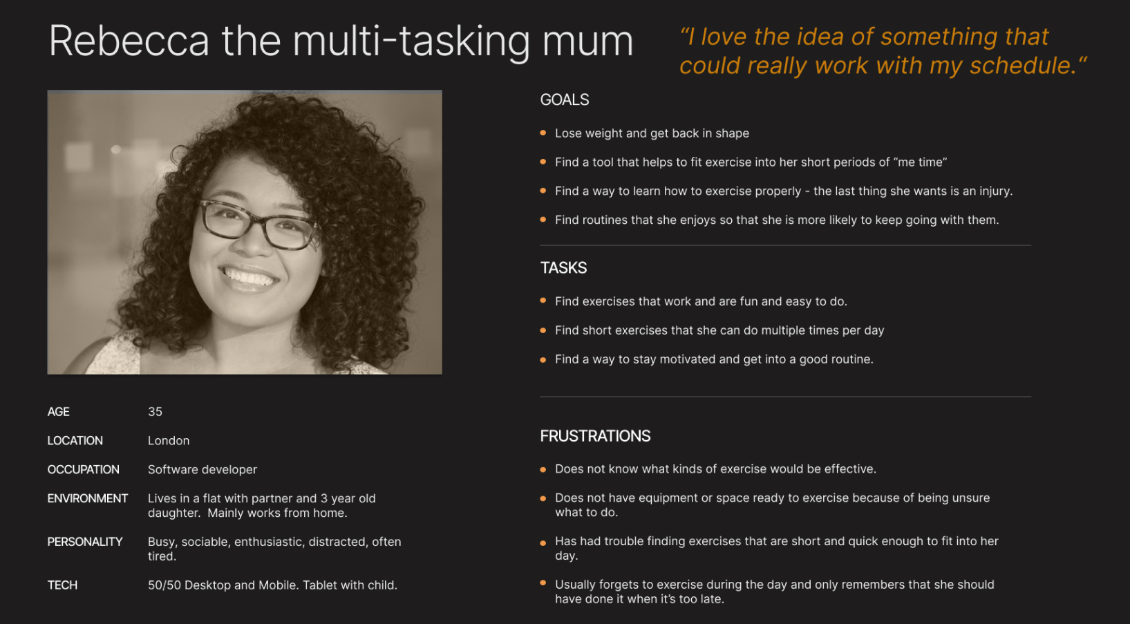

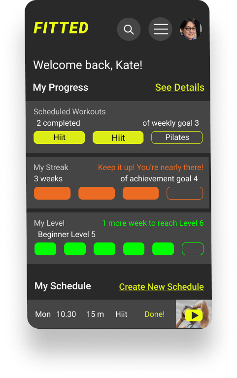
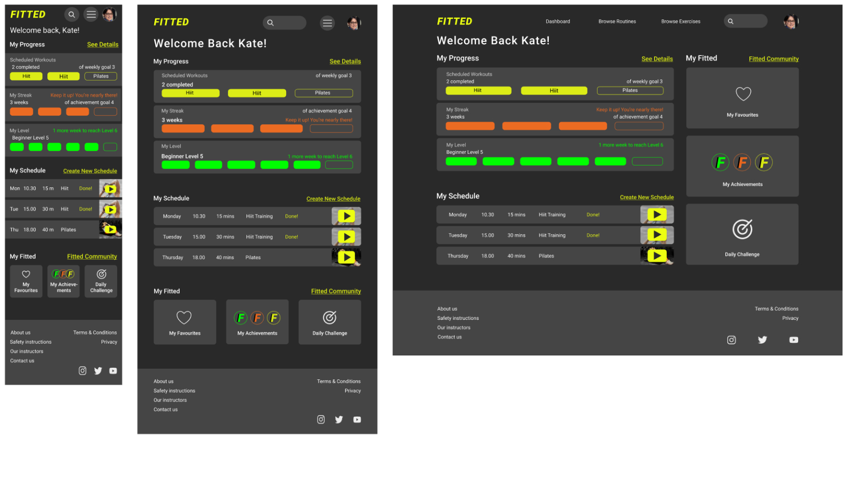
“As a frequent user I want to be able to schedule exercises so that I build positive habits.”

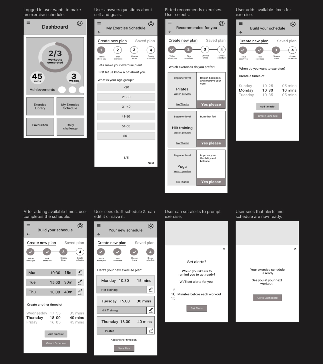
Once I was reasonably happy with my sketches I used Figma to create digital wireframes. I iterated on my low fidelity wireframes by paying attention to grids, including UI elements, and ensuring visual hierarchy. Low fidelity became Mid fidelity.
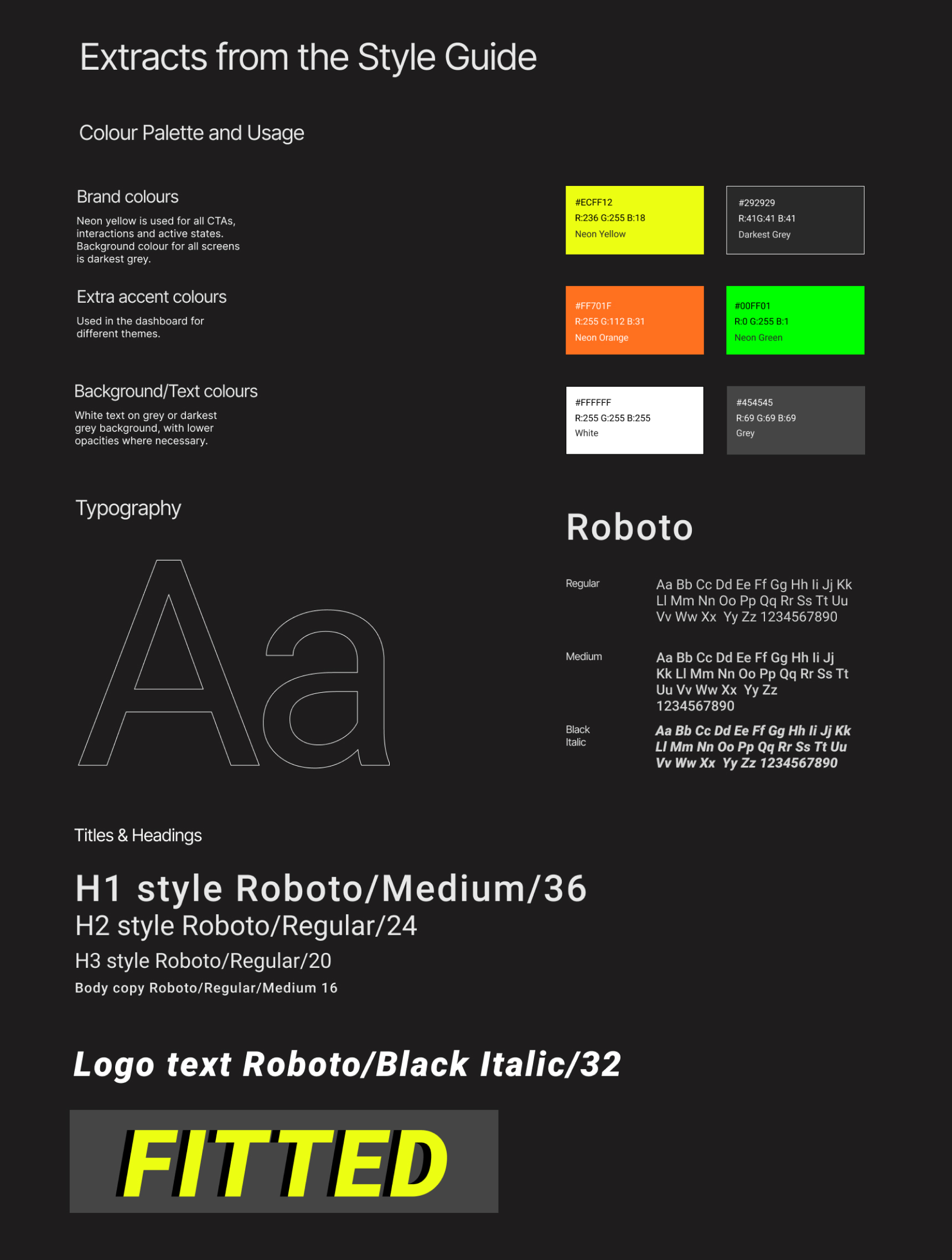
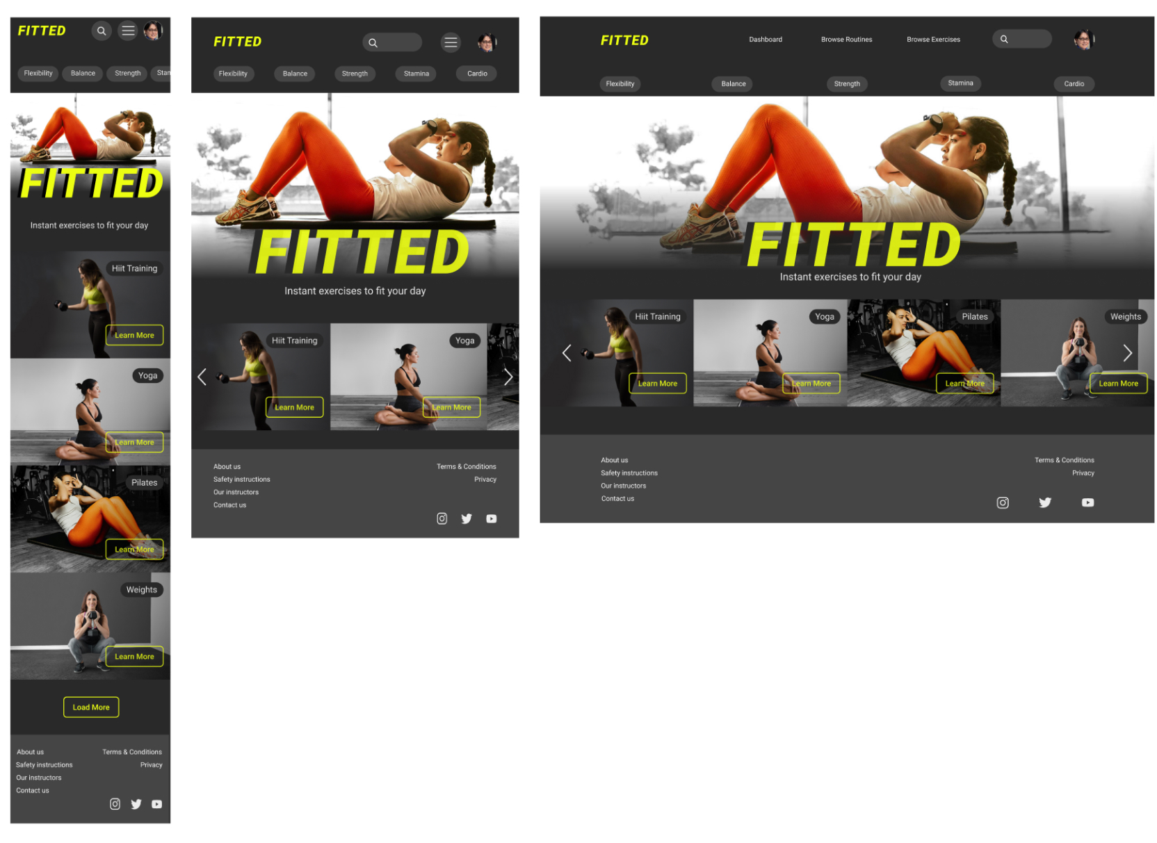
Starting from the partial branding guidelines, “fun and easy, orange and black” I created a sporty yet approachable feel to tempt users like Rebecca back into exercise.
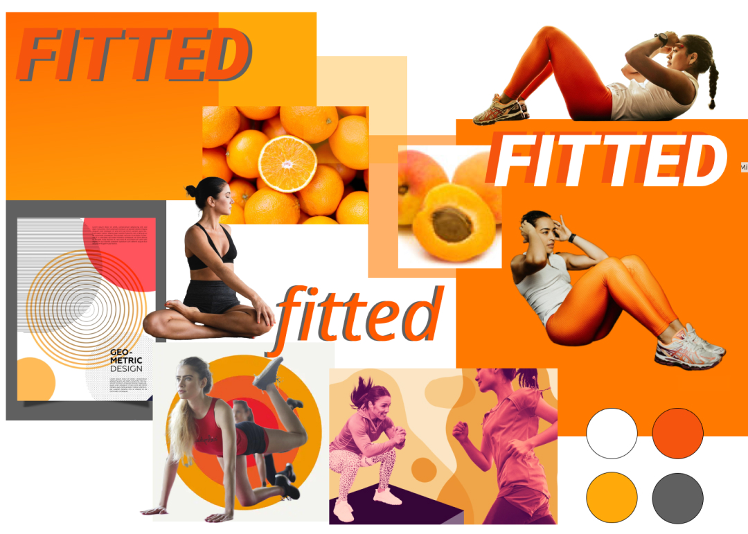
Guided by the feel of the moodboard I experimented with colour palettes, typography, imagery and icon design.
The intense colours of the moodboard became accent colours against a dark theme, which combined the accepted look of an exercise app with a less serious, more welcoming feel.
This colour palette is great for giving enough contrast for accessibility.
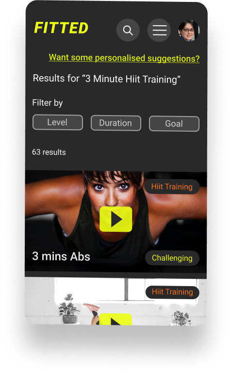
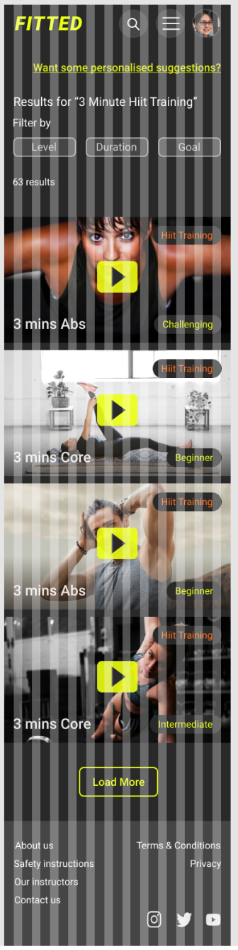
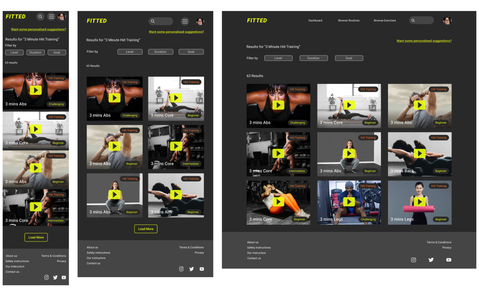
The parts I found most challenging when making the visual design were the places where I needed to work with photographs to create cards. Scaling, cropping or just finding appropriate photographs to use in the shape of a card was not straightforward. Most of the shapes of the grayscale design needed rethinking when converted into images. I was very happy to learn how to use components properly whilst trying to work these designs out.
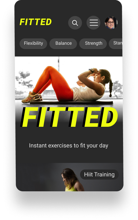
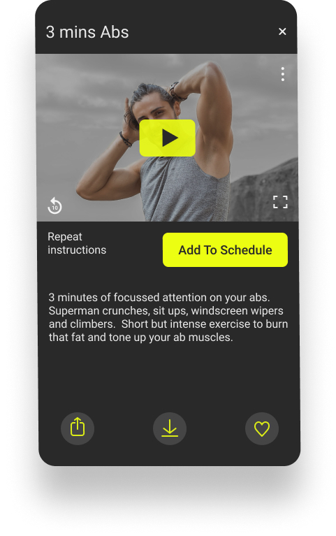
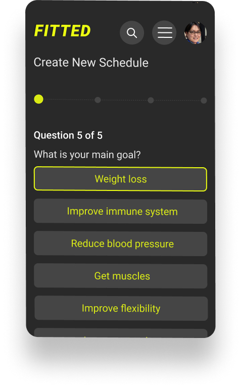
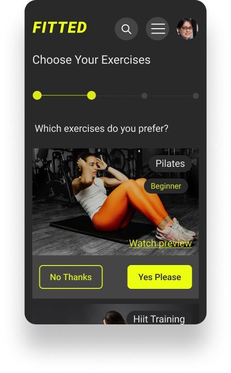
I tried to keep the style simple and clear and very accessible, with good contrast and legibility. I attempted to choose inclusive, non-intimidating images showing reasonably normal people instead of heavily muscled men or excessively thin women.
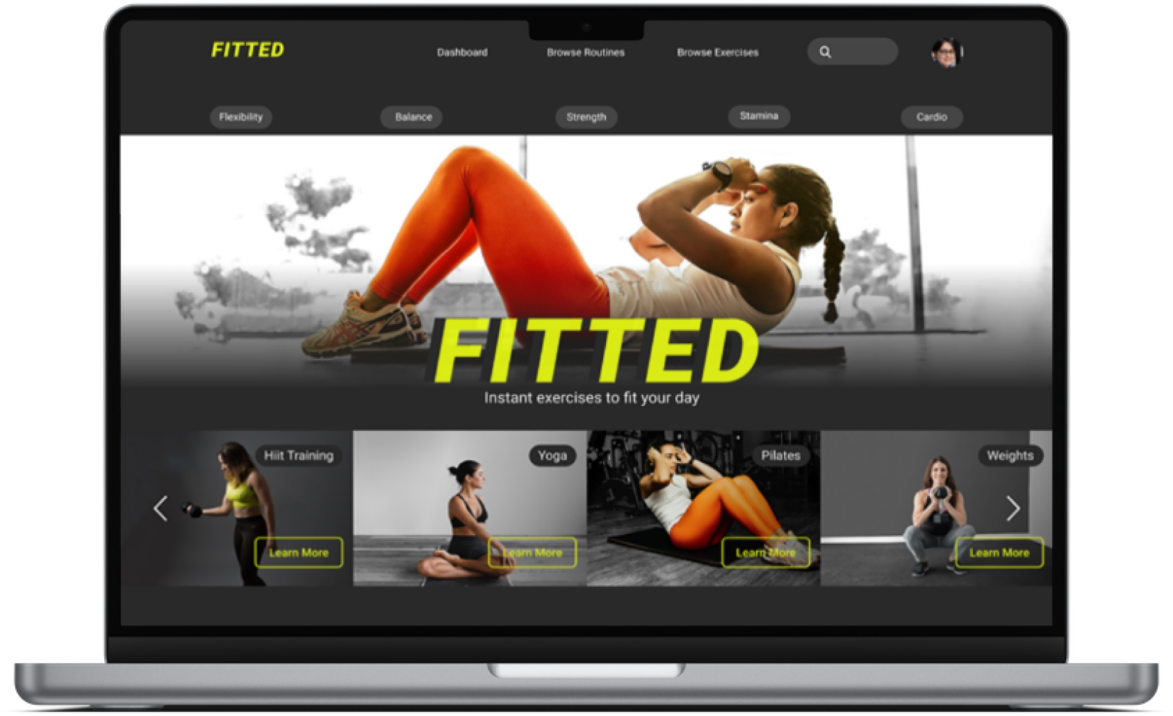
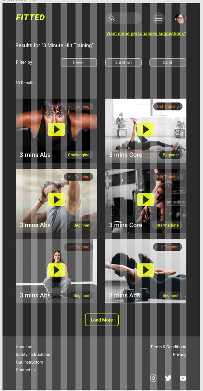
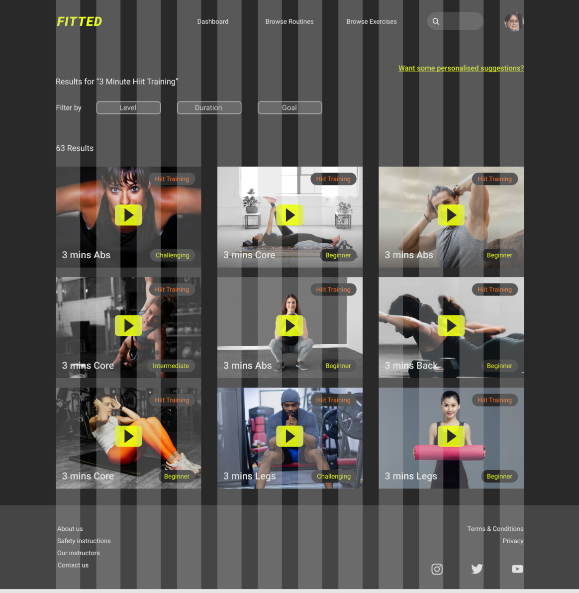
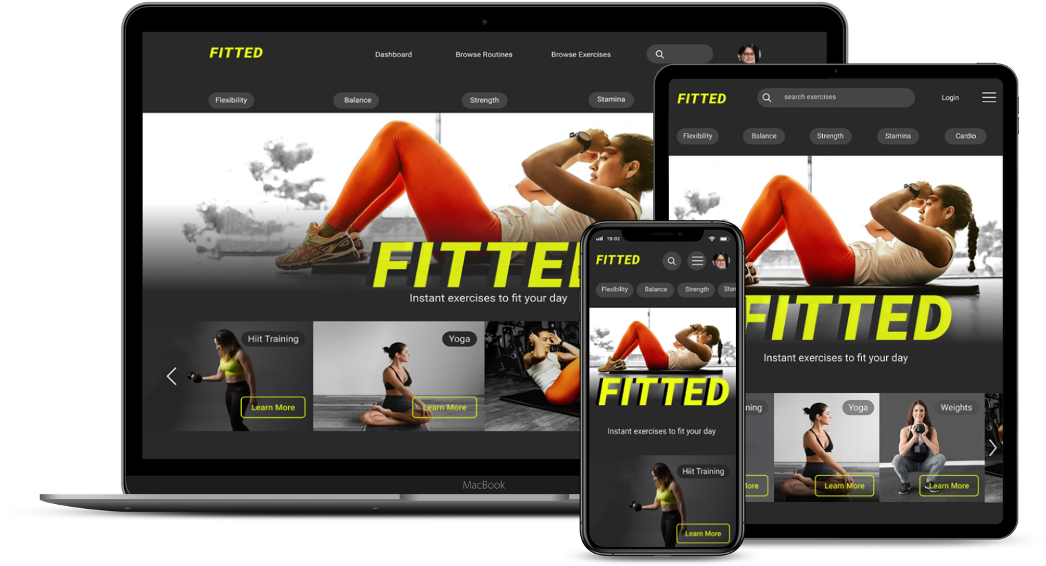
Having brought my mobile design to high fidelity, I then created designs for the Tablet and Desktop breakpoints, using a 12 column grid.
The most challenging part was creating desktop designs - there was a lot of space to fill! My understanding of how to use grids improved a lot during this part of the project (and also my understanding of what needs to stay the same between breakpoints.)
12 Columns
Margins 16px
Gutters 16px
12 Columns
Margins 52px
Gutters 32px
12 Columns
Margins 140px
Gutters 40px
Here's the current mobile prototype - in Figma. Click the image to enter...

This was my first project using Figma instead of Adobe XD, so I was really happy to begin to feel confident in using Figma. I found autolayout and variants difficult but really useful so those are things I will be trying to use all the time from now on.
Designing for different breakpoints was one of the most challenging but also rewarding parts of the project. Learning how to use the grid, and experiment with different grids for each breakpoint felt like a major breakthrough.
Working with a dark theme and using different opacities to improve the hierarchy and readability of text was new to me but added much needed subtlety to the design.
If I was going to take this project any further I would like to spend more time on creating the interactions. I enjoyed creating some of them but there were many more possibilities. As an alternative to photographs I considered using illustrations throughout the application. I think that would be an interesting way to go with this kind of app, to make it more inclusive and not project any ideas about the type of user it’s designed for. Working with illustrations is something I would like to explore in a future project.
No user testing was carried out in this project, so that would be the next step in carrying it forward.