Armadillo

Performance coaching for musicians.

Iphone mockup showing home page
DURATION
7 months
May - Sept 2021
TOOLS
Pen & paper
Marvel
Adobe XD
Photoshop
ROLE
Strategy
Research
UI Designer
UX Designer
PROCESS
User-centered design
Design Thinking
OVERVIEW

An application to help musicians learn psychological performance skills

Armadillo was a UX Immersion project in my CareerFoundry UX Design course. The brief was to create a responsive web application that allows users to get help from experts.
The problem
Musicians practice on their own in practice rooms. When they get on stage they often play less well than they can because of nerves. This is frustrating and upsetting for them.
The hypothesis
If musicians learn and practice psychological skills they may be able to perform better.
The solution
I proposed a web application to teach performance skills (through a course taught by an expert) and provide practice tools and opportunities through performance simulations and video calls.
Scope
I initially thought that it would be worthwhile to explore whether the same concept could apply to other user groups - people in nerve-wracking situations such as a job interview or a work presentation. As the project progressed it became apparent that solving for three user groups was too complex, so eventually I narrowed the scope back to only musicians.

The process

Arrow containing heading Understand

Understand

  • User interviews
  • Competitive Analysis
  • Surveys
Arrow containing heading Define.

Define

  • Affinity mapping
  • User personas
  • User journeys
Arrow containing heading Ideate

Ideate

  • User flows
  • Site maps
  • Wireframes
Arrow containing heading Prototype

Prototype

  • Iteration to mid-fidelity wireframes
  • Prototyping
Arrow containing heading Test

Test

  • Usability test plan
  • Affinity mapping
  • Rainbow spreadsheet
  • Test report
Arrow containing heading Implement

Implement

  • Visual design
  • Design system
  • Hi-fidelity mockups
  • Desktop prototype
Orange process marker "Understand"

Understand

Competitive Analysis: What's the competition like?

I analysed some competitors to identify their strengths and weaknesses and to help me form a view about my app's potential features and opportunities. I found only one competitor specialising in musicians but many different ones for interview coaching and presentation skills.

Bulletproof Musician is the website of Professor Noa Kageyama, a renowned performance coach at Juilliard in New York. He offers an in depth video course with exercises to do but if you want one-to-one coaching from him it costs $200 per hour.

Interview Buddy is an Indian application offering one-to-one practice interviews for students preparing to interview with US universities. I chose Interview Buddy because it was offering one-to-one mock interview sessions at a budget price ($18), which was an appealing idea.
Iphone mockup of Bulletproof musician homepage

Bulletproof Musician: SWOT Profile

Strengths

  • Appealing, trustworthy coach
  • Great free materials
  • High quality course
  • Money back guarantee

Opportunities

  • Could be widened to other user groups
  • Could develop better marketing strategy
  • Shorter videos
  • Money back guarantee

Weaknesses

  • Expensive ($200+)
  • Long videos (1 hour) may be offputting
  • Confusingly named courses
  • Website design

Threats

  • Free info/expertise could be copied
  • Money back guarantee could be exploited
Iphone mockup of Interview buddy homepage

InterviewBuddy: SWOT Profile

Strengths

  • Unusual and appealing offer
  • Cheap ($18 per mock interview)
  • Quality of mock interviewers (if true)
  • Nice UI

Opportunities

  • Proprietory conference software
  • Expanding to different countries (currently only India)

Weaknesses

  • Name is not unique
  • Marketing is weak
  • Offer seems too good to be true

Threats

  • Name confusion with competitors

Summary of features

Bulletproof Musician

InterviewBuddy

Armadillo (my project)

Type of course
9 x 1 hour long videos
No course provided
Course made up of short videos
Live practice?
Private sessions for $200 per hour
Practice interviews for $18 each
Practice performances by video call - individual or group?
Tools for practice
Exercises with video instructions
None
Recording Tool and performance simulations
Identity of expert
Single well-known expert
Many expert interviewers
Single relatable expert is necessary
Cost
High
Low
Aim low
Video calling tech
None
Own tech
Own video calling would be ideal

Surveys: What do musicians have to say about this?

I surveyed 64 musicians and 29 non-musicians to find out about their experience of performing, online courses and performance training. I found the musicians by posting the survey on a few musicians' groups on facebook including the Conservatorium van Amsterdam. The non-musicians came from my personal and CareerFoundry networks.
73%
of musicians were usually dissatisfied with their performances.
26%
had finished an online course
88%
were interested in online performance coaching
75%
never work on their performance skills when preparing for a performance

User interviews: Time to discuss the nitty gritty of performing

Based on the survey results I developed a script for interviews and interviewed three musicians and three non-musicians. I wanted to hear all about their behaviours, frustrations and needs around performing.
"I know I should practice my performance skills but I forget to do it"
"It's totally different when you get up on stage"
"I  try to practice in the venue itself or I try to visualise it...."
"Having good performance skills is a soloist thing..."
"I've watched some of those videos 25 times! I find them really useful."

Understand

Orange process marker "Define"

Define

Affinity mapping: looking for patterns

I synthesised the information from the surveys and interviews using affinity mapping to draw out themes. I grouped them into behaviours, attitudes, needs and frustrations.

Attitudes

  • Short videos are useful (long videos are offputting)
  • Performance coaching works
  • Performance coaching is too expensive
  • A video call performance can be as nerve-wracking as a real one

Behaviours

  • Nerves, distractions and getting put off by making a mistake are common experiences.
  • Waiting to perform is the time when nerves build up.
  • Practicing in the venue or visualising the venue is helpful.
  • Playing in front of people who make you nervous.
  • Recording yourself.
  • Practicing improvisation.

Needs

  • Some way of experiencing what it's like on stage;
  • An audience;
  • Prompting to practice performing;
  • A credible expert coach.

Frustrations

  • Lack of availability of performance coaching;
  • High cost of private coaching;
  • Bad performances after all that practice!

Understand

Orange process marker Define

Define

User Personas

I used my research to create user personas to help me put myself in my users' shoes. Luisa is a violinist and Emily is a job candidate.
User persona card: Luise the violinist
Meet Emily

Understand

Orange process marker "Define"

Define

User Journeys

User journeys helped me to imagine what Luisa and Emily would go through when interacting with my application - how they might feel and what they might be thinking. This was helpful for understanding their needs and pain points.
User Journey card: Luisa browses the application

Understand

Define

orange process marker "Ideate"

Ideate

Experimenting with solutions: User Flows

User flows helped me to map out some of Luisa and Emily's interactions in the app as they try to achieve some of their goals.
User Flow card: Luisa downloads useful advice
See Emily's user flow

Understand

Define

Orange process marker "ideate"

Ideate

Site map v.1

I brought everything together into the first sitemap, trying to create the most logical hierarchy and simplest navigational structure. The complexity of having three user groups is clear to see at this point.
Site map version 1

Understand

Define

orange process marker "Ideate"

Ideate

Low-fidelity wireframes

I started sketching my ideas with pen and paper.
Sketched wireframe of user quizSketched wireframe of personal assessmentSketched wireframe of dashboardSketched wireframe of performance simulator tool

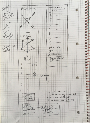
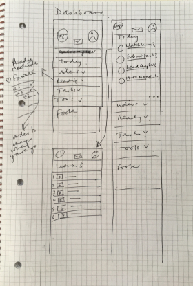
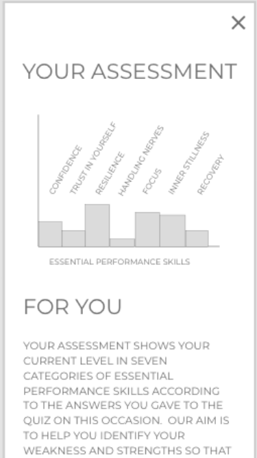
I thought users could take a quiz to assess their current performance skills.

They would get an assessment and suggestions for areas they should work on.

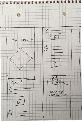
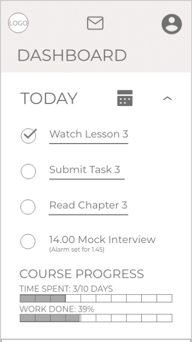
The dashboard would give access to the course, simulation/recording tools and video calls with coaches.

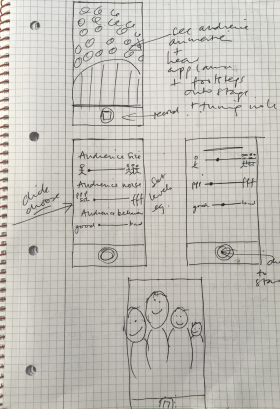
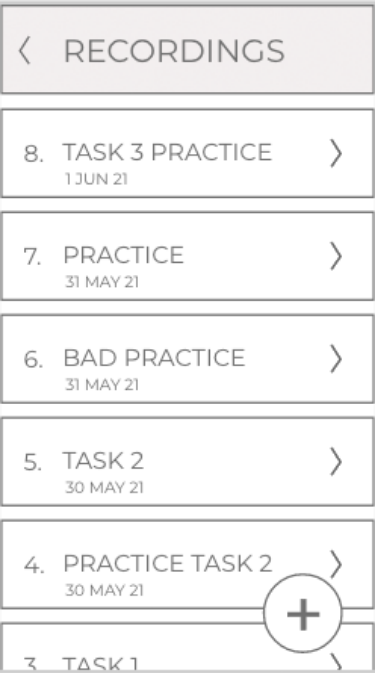
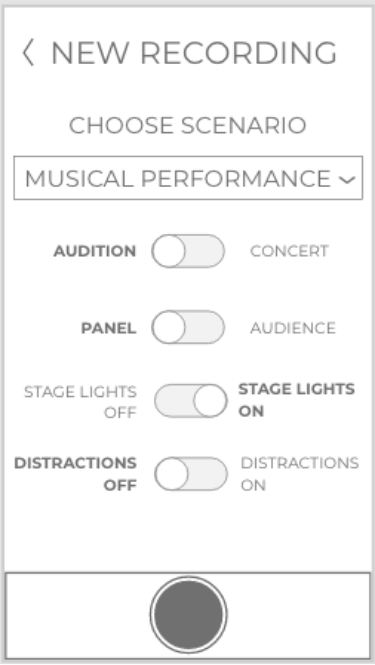
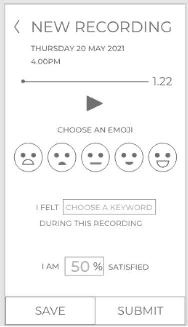
There would be realistic simulations of performances for practicing. The user could use settings to change these.

Understand

Define

Ideate

orange process marker "Prototype"

Prototype

Mid-fidelity wireframes

Once I'd established the necessary elements I made a low fidelity prototype in Adobe XD. I iterated on it to create a mid-fidelity prototype ready for user testing.

Home page: introduces the concept of the app

Mid fidelity wireframe of the homepage

Quiz: users  answer questions about their performance skills

Mid fidelity mobile wireframe of the quiz

Assessment: user gets advice about strengths/ weaknesses

Mid fidelity mobile wireframe of the user assessment provided after the quiz

Dashboard: provides materials, prompts and tools

Mid fidelity wireframe of the dashboard

Recording tool: allows users to record themselves practicing

Mid fidelity mobile wireframe showing the open recording tool

Scenarios: user can choose from different simulation options

Mid fidelity moblile wireframe showing user's options for creating a performance simulation

Simulation of a concert plays whilst user records themself.

Mid fidelity mobile wireframe showing image of simulation during a recording by the user

Self assessment: user makes quick assessment of their performance

Mid fidelity mobile wireframe showing quick assessment that user can do, optionally, after they record

User waits for a video call - mock interview in this case

Mid fidelity wireframe showing video call tool open whilst user waits for a mock interview to start

Understand

Define

Ideate

Prototype

orange process marker "Test"

Test

User testing: moment of truth

I made a usability test plan, carried out tests with six users and analysed and reported the results.

Test Objectives

  1. To determine whether users understand what the application is about and what it offers.
  2. To observe how users navigate the dashboard to carry out tasks.
  3. To assess user satisfaction after each task.

Affinity Mapping and Rainbow Spreadsheet

I grouped positive and negative quotes, observations and errors together and entered the information into a rainbow spreadsheet. This enabled me to determine the most important issues to fix in the prototype. Broadly speaking the home page caused confusion and raised many good questions from the users, but once they got to the dashboard tasks they could navigate them well.

Top 5 Issues to fix as a result of user testing

First issue:
Scope of app

Second issue:
Communication of the concept

Third issue:
Subscription plans

Fourth issue:
Enrollment options

Fifth issue:
CTAs

What is the problem?

Users struggle to understand who the app is really for - musicians, interview candidates or presenters.
There's a lot of text in the homepage but users still have a lot of valid questions. The text isn't working to communicate the concept clearly.
Current subscription plans (short course or monthly subscription) are not making sense to users. Most users got bogged down in trying to decide what they both offered.
The enrollment process causes confusion. Problems include the CTAs, the purpose of the custom plan creation and the payment flow.
There's a lack of clarity with CTAs. Some don't even look like CTAs to users and other things do look like CTAs when they are not.

Typical quote

"Is it for people who work in the media?"
"How much time does it take every day?"

"Do I need to pass a test?"
"Why would I need to subscribe monthly?"

"There's no free taster thing"
"A custom plan made of what?"

"It can't be very personalised for that price!"
"I would never click those because I don't know what I'm getting into"

Severity

HIGH SEVERITY

HIGH SEVERITY

HIGH SEVERITY

HIGH SEVERITY

HIGH SEVERITY

Solution

Reduce the scope to those who understand it and need it most: Musicians.

This big change will help focus and simplify the concept.
Reduce the amount of text. Somehow simplify the presentation of the concept so it's clear. The reduction in scope will help this.
Simpify the subscription plan by offering a two week trial period followed by one subscription option. This also makes sense for musicians, more than for the other two user groups.
Ditch the custom plan creation idea. Although users like the idea it creates a lot of complexity. It is less relevant to musicians than to interview candidates in any case.
Clarify all CTAs and ensure consistency across site.

Understand

Define

Ideate

Prototype

Test

orange process marker "Implement"

Implement

Time to add some colour

Having identified what I needed to fix I finally reached the moment when I could try to bring my design to life by creating the visuals. I iterated on my visual designs many times using principles of emotional design, gestalt theory, grids, peer feedback and accessibility guidelines. I carried out frequent informal testing, preference testing and sought and acted upon feedback from peers, tutors and mentors.

Home page iterations

First visual design
Second visual design
(tested by peers)
Third visual design
(after peer feedback)
Fourth visual design
(after mentor feedback and taking account of accessibility guidelines)
Mobile home page visual design first iterationMobile homepage visual design second iteration Mobile homepage visual design third iterationMobile homepage visual design fourth iteration

Feedback:

"Is it for children?"

Feedback:

Better visually.

I paid attention to gestalt theory, grids etc.

Feedback:

Better spacing.

I tried to reduce cognitive load.

Feedback:

Better contrast.

Logo incorporates name now.

Better placing of banner.

Dashboard + "To do list" iterations

First design for dashboard
First visual design of "Today" page
Second visual design of the dashboard
(after peer feedback)
Second visual design of "To Do List"
(for accessibility)
Mobile dashboard visual design first iterationMobile dashboard Today page visual design first iterationMobile dashboard visual design second iterationMobile dashboard open "To do list" page second iteration

Feedback:

Extra text and upper case cause cognitive overload.

Feedback:

Lack of detail and hierarchy are confusing for users.

Feedback:

Simplified navigation.
Reduced text.
Clear hierarchy.

Feedback:

Helper text.
Meaningful labels.
Clear hierarchy.

Forms iterations

First/Second "Create Account" design
Third visual design
(after peer feedback)
Fourth visual design
(for accessibility)
Fifth iteration
(after UI course)

Feedback:

Too long - needs scrolling.
Too much bold text.

Feedback:

No need to scroll.
Reduced cognitive load through lighter text.
Eye icon is too big.

Feedback:

Improved contrast.
Example text as a placeholder.

Feedback:

Labels always visible.
CTA text changed from upper case.

Understand

Define

Ideate

Prototype

Test

orange process marker "Implement"

Implement

Site map v.2

After reducing the scope to just one user group and iterating many times I was glad to see that the site map had become much simpler.
Sitemap version two - much simpler now.

Understand

Define

Ideate

Prototype

Test

orange process marker "Implement"

Implement

Responsive Design: Desktop Prototype

Finishing the desktop prototype for Armadillo would be the next stage in this project. Musicians have said that they would prefer to use their laptops for doing the course and the video call performances. The performance simulations would also be much more convincing on a larger screen. Here's my first iteration of the dashboard in the desktop version. There's a long way to go!
Desktop prototype dashboard first visual design

Understand

Define

Ideate

Prototype

Test

Implement

Design System

I created a design language system setting out the rules for Armadillo's design. This will help to create consistency across different platforms and make it easier to develop new screens as time goes on.
Design Language System showing colours, typography, accessibility principles

Understand

Define

Ideate

Prototype

Test

Implement

The current prototype

Having completed a "UI for UX designers" specialisation course at CareerFoundry after finishing this project I iterated again on the prototype with a view to improving the UI.
Iphone mockup showing homepage

Retrospective

What went well in this project?

User testing and feedback from peers was incredibly useful.

The decision to reduce the scope of the project back to one user group and the direction of the visual design were both positive changes which were prompted by user testing. Because there were no constraints on the project I struggled with deciding whether to make it more generally applicable to users in many situations, or to specialise in one area. It took a while to realise that specialisation was a better course to take.

What went less well?

My research held all of the clues pointing to the fact that trying to provide for three different user groups' needs was going to be too difficult, but I was so interested in finding the similarities between user groups that I failed to delve deeply enough into the differences.

That early failing sent me off in a direction that was probably doomed to fail. Naivety, over-enthusiasm and lack of experience (plus the intense time pressure of the course (there were 57 tasks to complete in this project), which meant it was, at times, difficult to take a step back from the small picture to see the big picture) probably contributed to this mistake.

As a result of the complexity of the concept I put too much detail into the wireframes, which led to more questions arising during user testing. It probably would have been better not to have tried to explain the concept in detail at that point.

What will I do differently next time?

I will carry out much more frequent user testing.

I will be more organised with naming my layers properly as I go, instead of leaving it to the end. Similarly I will try to document my process as I go for my next case study.

I will try to guard against analysing my research results from a certain viewpoint. I will try to seek evidence for the contrary (or other viewpoints so that I can form a more complete view.

I will be careful about keeping a realistic scope at the beginning of a project. It's much better to widen the scope after creating something than to have to narrow it in order to make it more feasible.

I will use figma! I struggled to use Adobe XD efficiently during the project but after subsequently learning figma I found that I could use XD much better than before. But overall I find figma easier to use than XD.